Gravik Edge
Concept Project
Overview Services
Gravik Edge is a concept project for an action-sports Brand Identity, Brand Messaging, Illustration
brand inspired by BMX and snow culture. The goal & Social Media
was to capture a sense of rebellion, movement, and
individuality.

The Background
In a culture driven by adrenaline, style, and self-expression, Gravik Edge was imagined as a brand that doesn’t follow trends—it carves its own path. Inspired by the raw energy of underground BMX scenes and the freedom of snow-covered backcountry, the brand needed a bold identity that could live across apparel, gear, and digital spaces. This concept explores how visual branding can reflect attitude, movement, and community in the action-sports world.

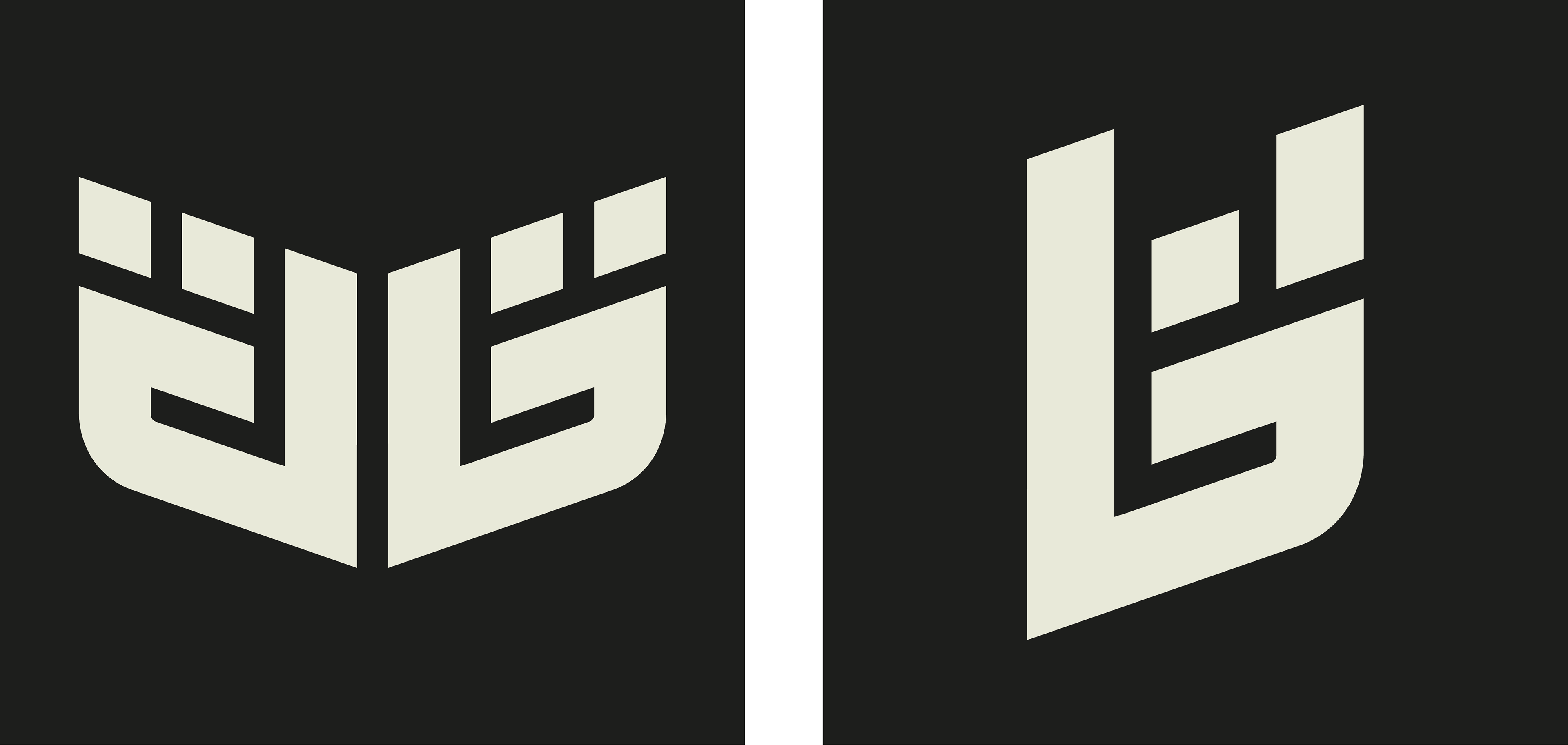
The Process.
The branding process began with a deep dive into the target audience and project goals through a series of discovery questions.
I then researched competitors and sketched ideas. The initial concept featured an abstract "G" shaped like a rebellious hand, tying into the brand's core values. While early versions felt too playful, refinements led to a bold, sporty design that better reflects Gravik Edge’s message.
Colors & Assets.
When designing the assets and choosing the color palette, I aimed for something that instantly feels fast and grabs attention. The icons reflect the brand’s core values—community and rebellion.

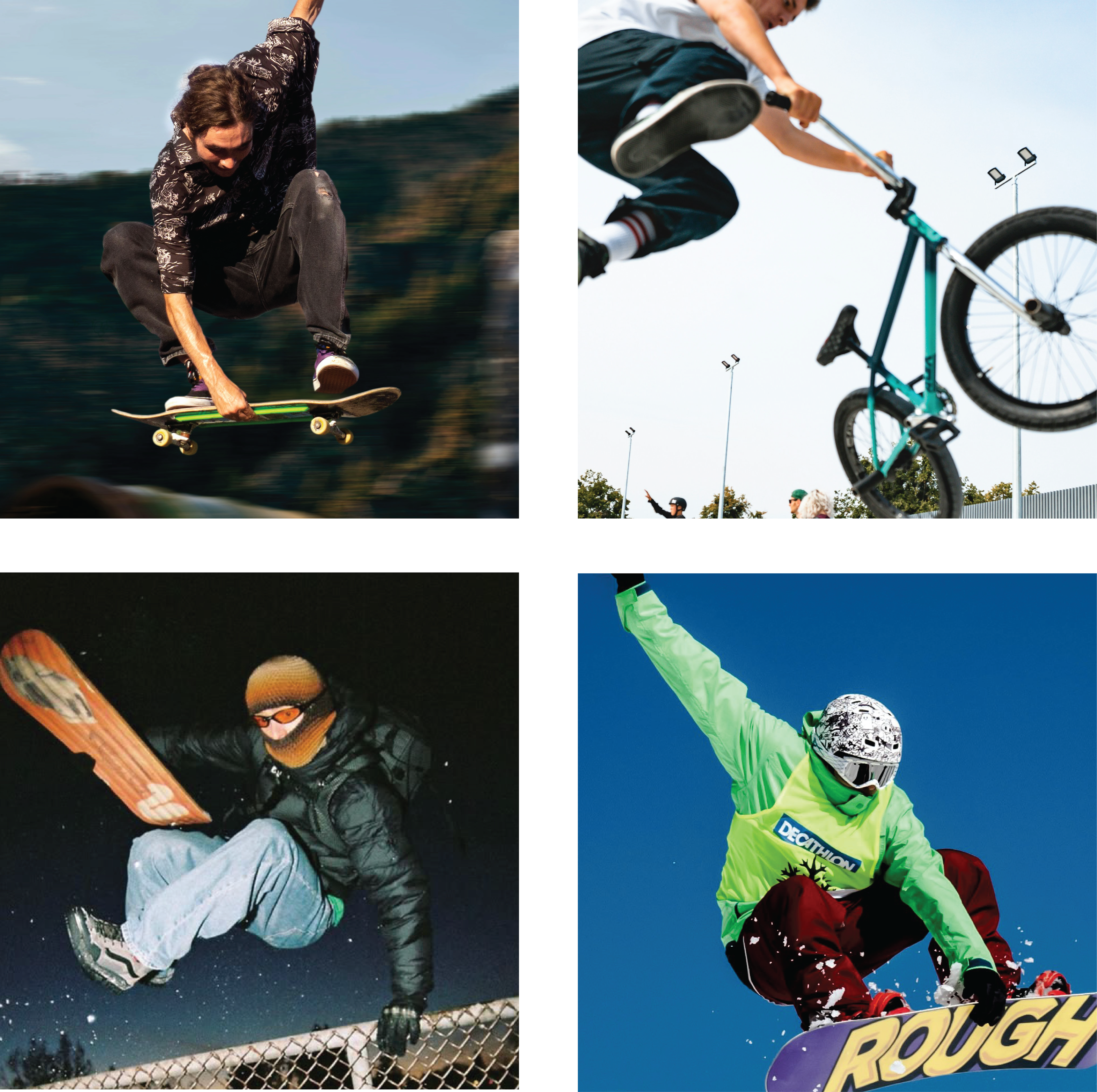
Brand in the real world
I used mockups to show the brand on BMX bikes, skateboards, and snowboards,
using the logo and custom assets I designed.

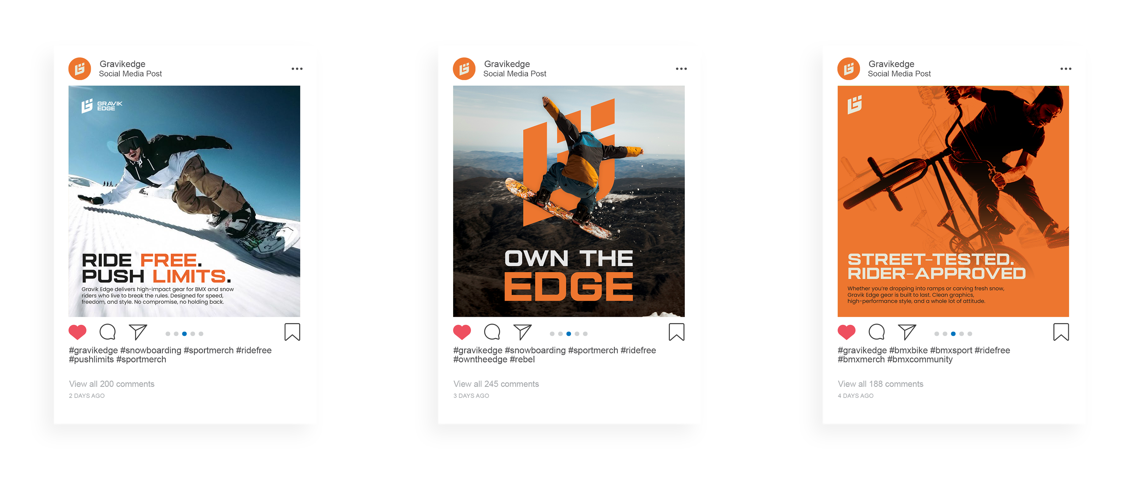
Social Media
Social media plays a big role in today’s world, so I focused on creating bold,
eye-catching visuals tailored to the brand’s audience. I used the brand’s
color palette, custom assets, and imagery to ensure a strong and consistent
visual identity.