Madre Fuego
Concept Project
Overview Services
Madre Fuego believes food should make you feel something. Brand Identity, Brand Messaging, Illustration,
In a world full of bland choices and watered down flavors, Packaging Design
your table deserves better. The last thing you need is a sauce
that plays it safe, made in a factory or tasting like nothing,
Real ingredients. Real fire.
Design goals
When bringing Madre Fuego to life, I wanted to move away from the generic visual language that saturates the hot sauce market. Peppers, flames, the usual suspects. Instead I was drawn to something with more character and cultural depth. Something that felt premium but never cold, and carried that sense of being genuinely handmade and made with love.

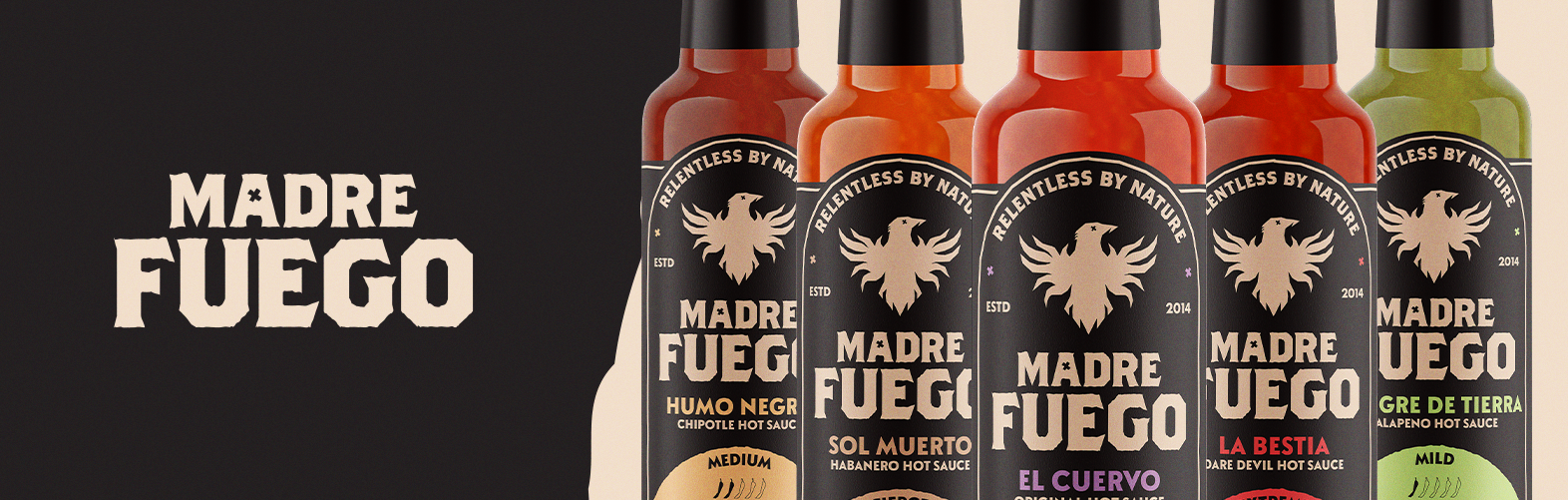
Logomark
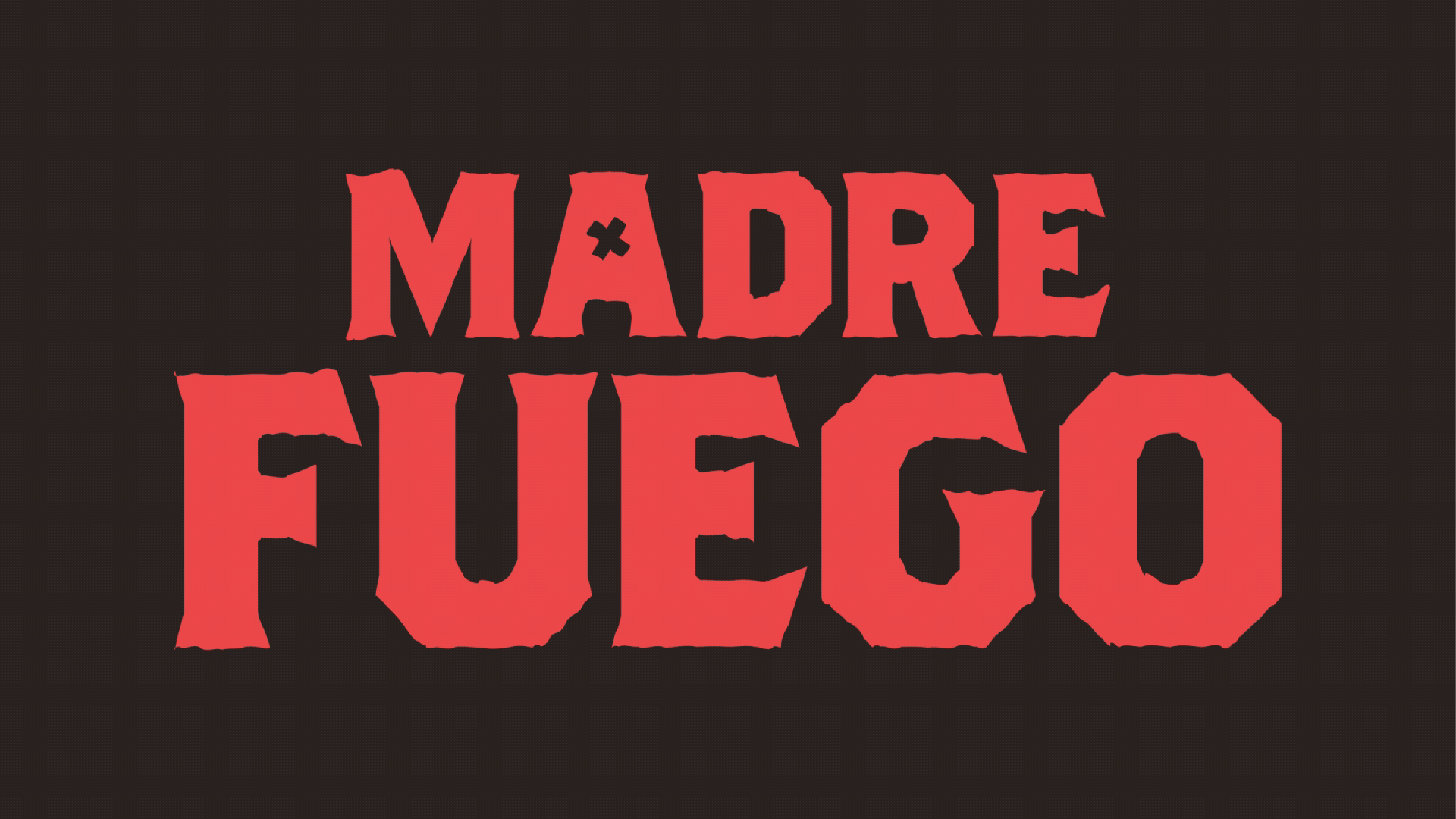
Wordmark
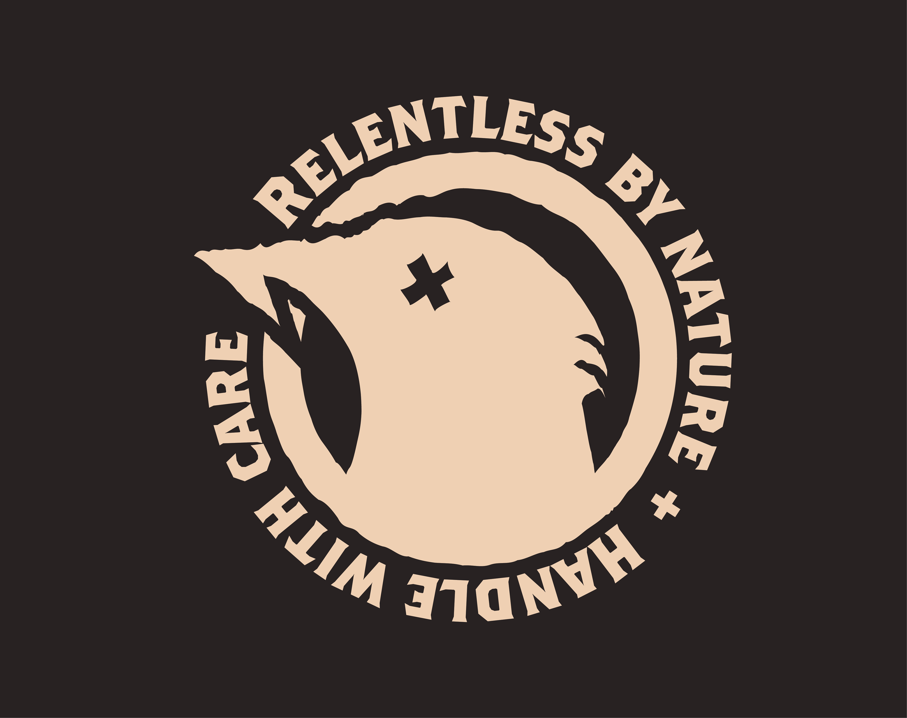
Icon
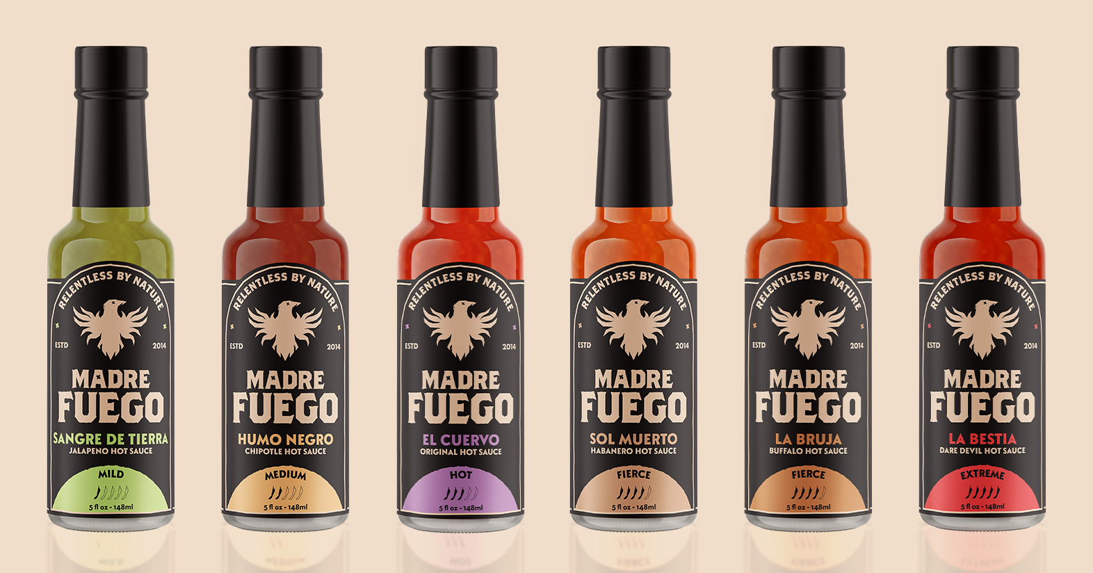
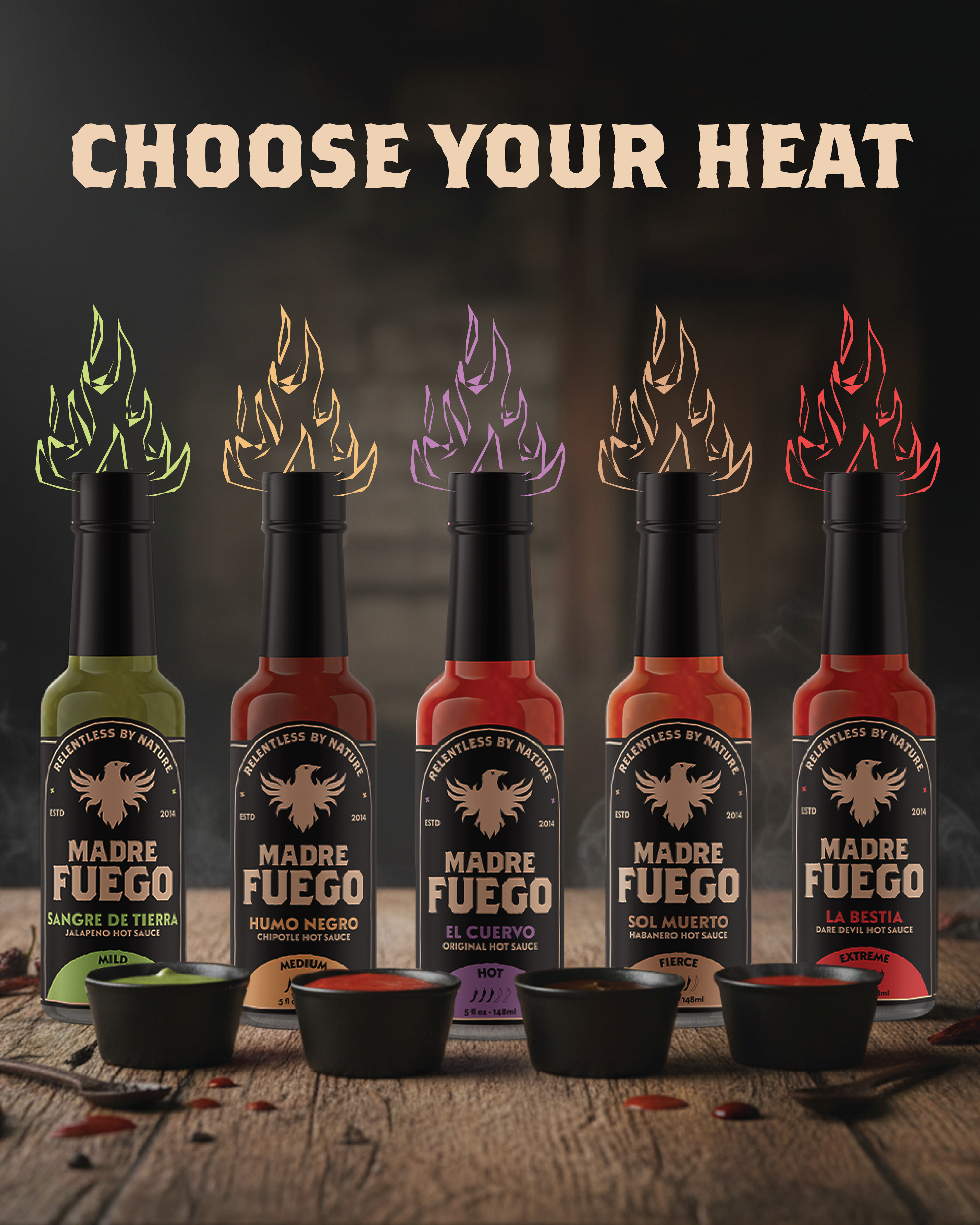
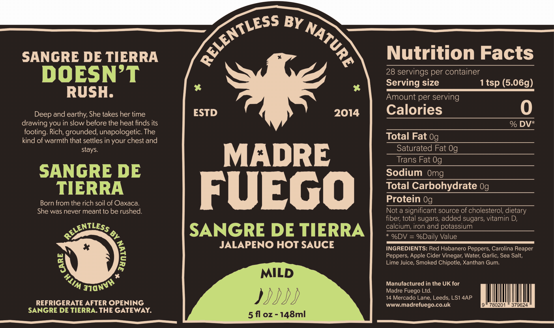
Packaging Design
Designing the packaging for Madre Fuego, I knew it had to carry the same handmade authenticity as the logos. To achieve this I opted for washed, vintage tones that felt lived in without sacrificing that premium quality. Rough edges and hand drawn textures reinforced that sense of something crafted by real hands, not produced by a machine.
Color played a huge role too. Each sauce needed high contrast while also representing its own flavor profile. The kind of packaging where you can almost taste what's inside before you've even opened it.
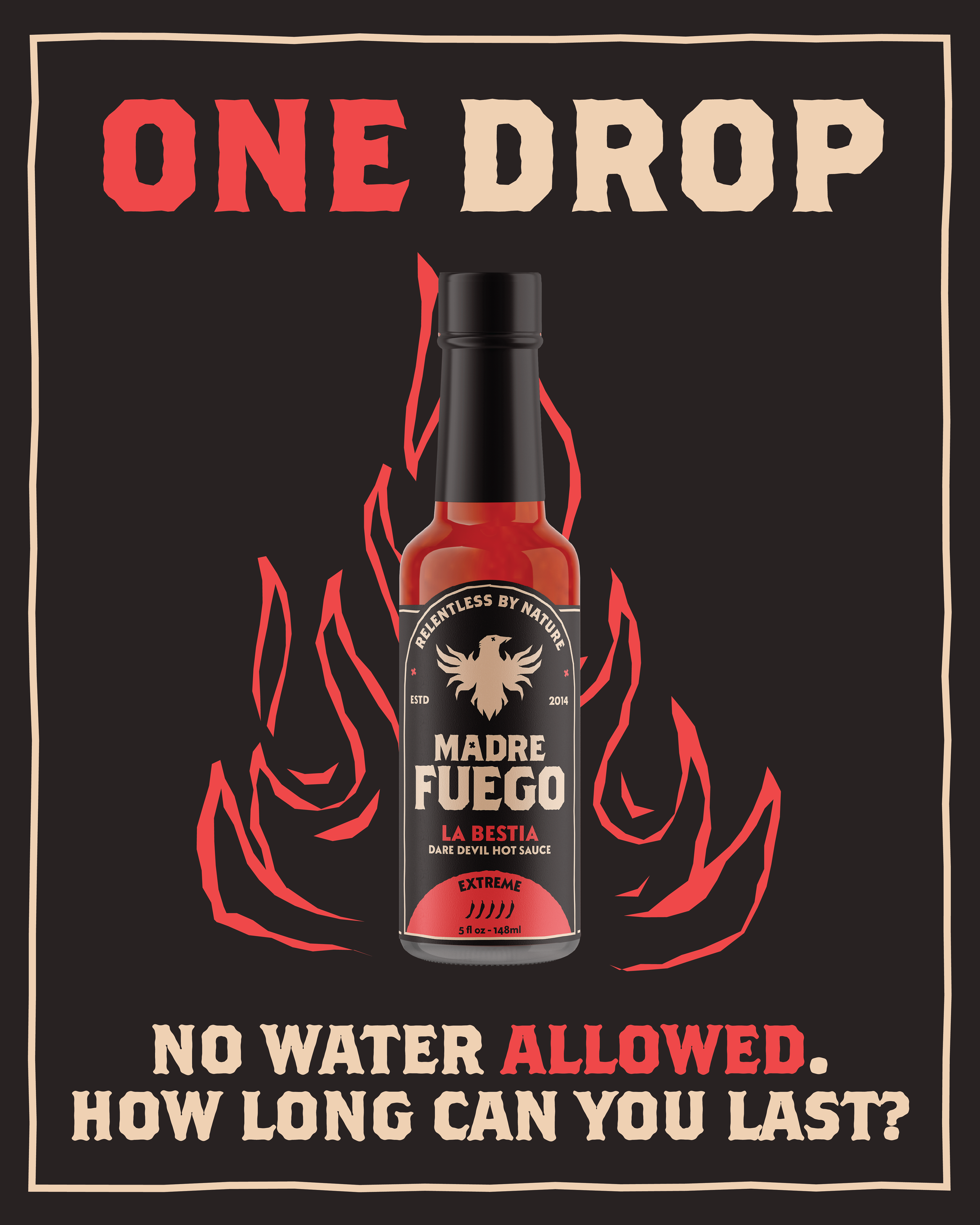
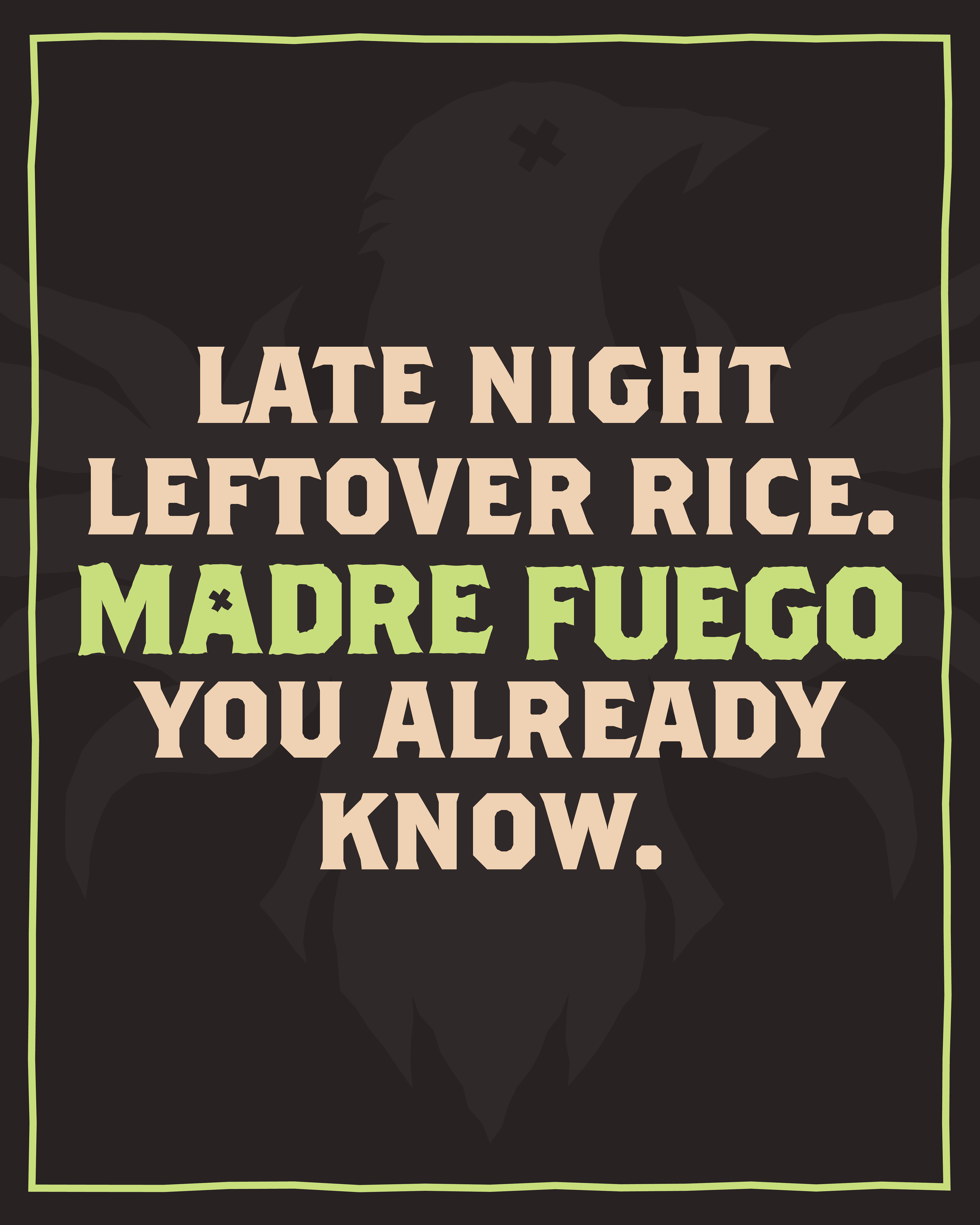
Social media design
To maintain brand consistency across every touchpoint, I developed a suite of social media templates built for longevity. Designed to grow with the brand rather than date quickly. Like the packaging, hand drawn textures and raw visual elements were carried through into the digital space. Ensuring that handmade authenticity never gets lost, even on a screen.